Mobile Website Designing
We don’t just design websites. We create real-life experiences through human-centric designs and storytelling.
Contact Us
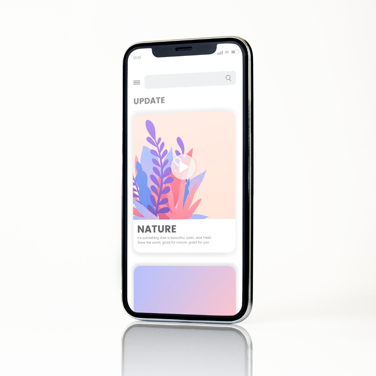
Mobile First Designs to Seal Your Deal
And to Seal Our Deal !
Matrix Infotech Solution, India's top web design and digital marketing firm, provides specialised mobile website design services. Nowadays, everyone uses their mobile devices to access the internet while on the go.
Google made mobile first indexing mandatory earlier in 2018, claiming that they have been witnessing more queries coming from mobile devices than desktops for some time. As a result, the transition to mobile-first website design necessitates rapid action. No firm can afford not to embrace a mobile first strategy as mobile internet speeds continue to increase and costs fall throughout the world.
Use Our Mobile First Designing Services & Get :
? Shorter loading times
? Modern Mobile Website Designs
? Thoroughly designed Designs based on User Navigation and Traffic Patterns
? Ensuring cross-platform Compatibility
What is Mobile First Web Design?
A mobile first website design, as the name implies, is one that is created with the screen size and characteristics of a mobile or smartphone in mind.
Mobile first design components will make it easier for both search engines and people to explore, browse, study, shop, and buy from their mobile browser.
Why You Need Mobile First Design
As a top mobile first design firm, we can tell you that using a mobile first approach to website design may provide you a substantial advantage by making it easier for potential consumers to locate and browse your website than your competitor's.
If you want to stay current in the business, you must have a mobile-first responsive site design.
Main Features of Our Mobile Website Designing
Checkout Blogs
Let’s Check Some Latest Blog From the Topic

1 year
ago
UI/UX design is far more than just creating attractive visuals—it’s about creating meaningful
...
Read More

2 years
ago
In a fiercely competitive landscape, your smartphone app design is more than just a tool – it's a...
Read More

2 years
ago
User Experience (UX) design is a critical aspect of web development, as it focuses on creating webs...
Read More
Our Portfolio
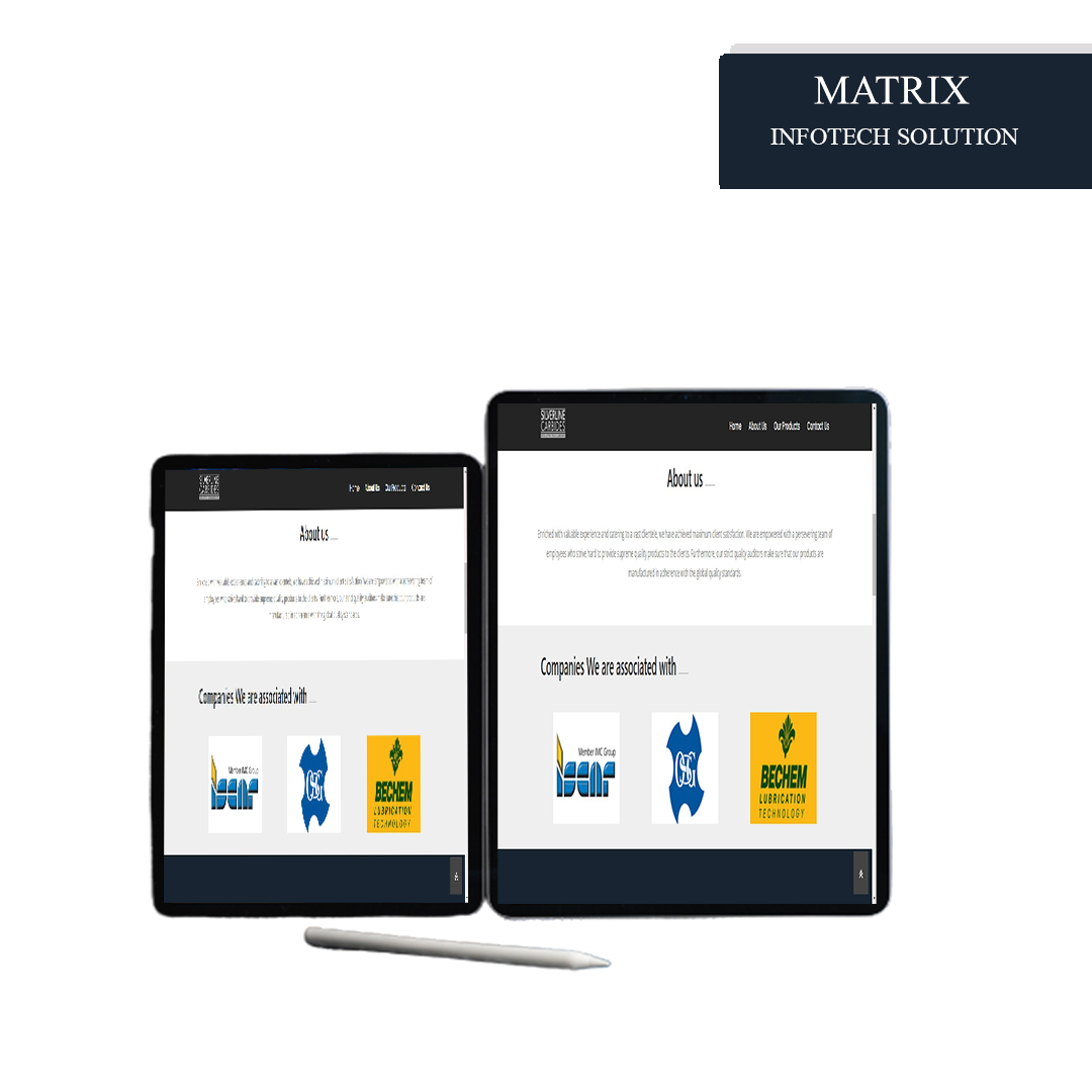
Hardware Business Web PHP BootStrap HTML

IT Business Web HTML BootStrap JS PHP

Truck Hiring Portal Web HTML BootStrap PHP
Frequently Asked Questions
With the fast growth of mobile usage, it is critical to consider how people interact with their devices. Designing digital experiences for mobile first, rather than for desktop or other platforms, is known as mobile-first design. A mobile-first website will feature a user experience and design that is optimized for adaptability, viewability, and usability on mobile devices.
In the following ways, mobile websites differ from desktop websites:
1. Mobile websites tend to load faster since they use lighter graphics and pictures.
2. They adjust to mobile phone and smartphone screen sizes and specs.
3. They have a better user experience, with easier-to-read typefaces, a more compact layout, improved pictures, and deliberate prioritising.
4. They're made to make navigating, browsing, and shopping on a mobile browser easier.
5. Mobile websites often have less material than desktop websites, with just the most important information remaining.
6. Most mobile websites are built for vertical navigation rather than horizontal navigation on a PC.


 By Nitish Choudhary
 By
By